Page Design Practises to Boost the Conversion Rate Marketing

There are a billion of business which is registered online and Google or other search engines rank the website or business based on several key factors. And for an online business owner or even a marketer website conversion rates plays a very crucial role for a business to be successful.
There are thousands or millions today who have managed to get a handful of traffic into their website, but a high volume of traffic doesn’t mean they will be converting. There is no meaning of traffic if your products or services do not sell.
There are free tools to check few things which matter such as bounce rates, shopping cart escape rate, and other useful metrics. This data will give you an overview of the customers and help you understand what isn’t your product selling.
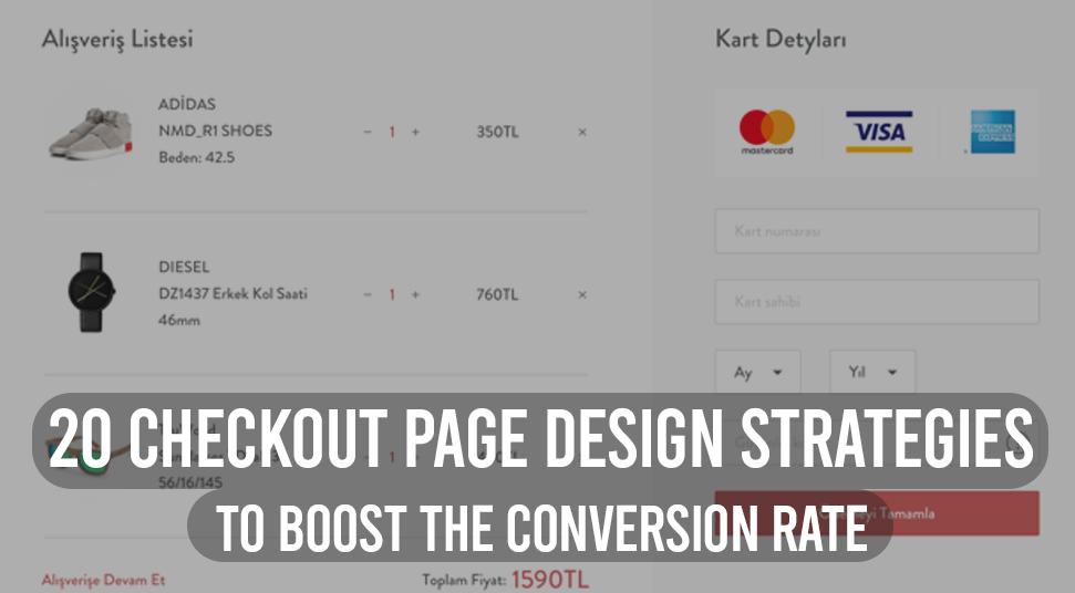
Do not mind me saying, that you might have the best and variety of product for your customers, but still, your website’s conversion rate is poor, so that means there is a problem with your checkout page layout and people have a tendency of neglecting the check out process if it is too lengthy, hectic and boring.
Now when you know what the problem is, we should look for the solution, because ultimately SALES is what your business needs. You must improve your conversion rate marketing. so that your client doesn’t face difficulty while checking out.
Shopping cart abandonment is a real issue in eCommerce platforms and a study found out that 69 among 100 customers who start the checkout end up leaving the page due to specific reasons that we are going to discuss below.
Customers usually want their checkout to be smooth and seamless, and if we can solve this factor, then no one can stop you from boosting conversion rates and making revenues.
10 Reasons due to which your shoppers usually abandon:
- 56 percent of shoppers expect a lower cost than the actual price.
- 36 percent says, that they found a better price from another website.
- More than 25 percent of buyers feel the website navigation is complicated and hectic.
- 18 percent of people go through extreme payment security checks.
- 21 percent of buyers say that the process is too long to wait for.
- 17 percent showed concern about payment security.
- Delivery option unavailable is a factor that is faced by almost 16 percent of buyers.
- 11 percent reported payment declination repeatedly.
- 24 percent reports website crash.
- One of the common things is 13 percent say pricing is in foreign currency.
Now without wasting time, let’s dig in to know how to avoid the above-said factors and more importantly how to boost conversion rate.
Here are 7 Best Checkout Page Design Practises
In order to escalate your conversion rate marketing and lower abandon rates, you need to adapt the best Checkout practices.
1. Streamlining the Design
A simple design can take your breath away if all the elements are optimized perfectly. Keep the design of your checkout page and pricing page very simple with mandatory options.
Do not entertain unwanted elements because if your checkout page is stuffed with unnecessary elements like top navigation, sidebars, and other stuff, because the less element you will keep the more focus they will give on the pricing and carts.
2. Create plans according to buyer personas
Every giant eCommerce business researches about buyer persona because it is a very important point while you sell your product.
Just, for example, you can’t sell Women sports shoes to men.
Buyer personas play a crucial part in marketing strategy.B.P will help you to know about your buyer’s interest and buying behavior. Buyer persona data include information such as age, gender, demographic information, source of marketing and a few others.
The buyer’s information will help create promotions and offers based on buyer interest. Thes e plans and packages can meet their needs.
3. Create specific landing pages for different targeted buyers
Offering different landing pages to specific customers will bring great changes in your conversion and sales.
Audience segmentation is a great way to reach the right audiences in the right way.
Let’s suppose, you and your father shops from the same eComm platform, but necessarily your choice won’t go with your father’s choice, he might like a regular fit Chinos for corporate purposes, whereas you like a skinny fit for casual purposes.
So creating landing pages based on buyer preference would bring greater outcome and help boost your total conversion rates.
4. Make sure you secure Checkout process
Most of the people fear while checking out. Security is one of the reasons for cart abandonment. You must keep your checkout process as secure as you can,
Just make sure that you have a secured site( Htpps) at first, otherwise, potential customers could avoid your site for buying. You must use a legit payment gateway and ask your provider to make sure nothing goes wrong. If your checkout process is not secure people won’t feel safe entering their credit card information.
Every checkout page must be enhanced with payment security, and if possible try to add security certificates from Norton and McAfee. This can build trust among buyers.
5. Currency Conversion
When it comes to online marketing, the whole world is their market and you also never know who would turn out to be your potential customer. Maximum online buyers want the price to be in their local currency because they are used to that and precisely know what is the amount.
People don’t have time to convert international currencies to local if it isn’t a major need.
You have very limited options for this, but this is an important thing. You can integrate a currency converting app in your website to do the job because manual price entry would take a lot of time.
6. Optimize your site for Mobiles
People use their mobile devices more than they use a personal computer. In fact, 62 percent of people having a smartphone prefer making online purchases from mobile devices. Buyers feel more convenient shopping from Mobiles.
You want to go for a search when you are in a metro or cab,you can’t because either you have to take out your laptop and connect it to the internet or you have to go for Mobile search.
1.8 billion people currently use their mobile phones for online shopping. So, it is mandatory to optimize your site for Mobile devices. In return, it will escalate the chances of your conversion.
Your checkout page shouldn’t be slow while buyers are checking out via mobile or there is a chance that customers will bounce.
7. More Payment Options
The most important step of the checkout is the payment step. Research says, that more than 54 percent of people/buyers feel having a range of payment options is very crucial and helpful while checking out online.
For example, let’s say you want to buy an Xbox 360 but while you are checking out you notice that the website has limited payment options, and when you are not comfortable with the given limited options, you would definitely go to another Website where there are various payment methods.
You need to add other payment options apart from traditional credit and debit card payments. Try bringing alternative methods like electronic payment systems or NEFT or even Cash/Card on Delivery.
Wrapping it Up
Discussion about 7 Best Checkout Page Design Practises To Boost The Conversion Rate comes to an end. These conversion-boosting strategies for your eComm checkout process aren’t rocket science and will definitely help you grow your future business.
These are simple methods to drive more traffic and increase conversion rate as much as it could. You would definitely see a lift if you stick to the advised key factors

 The Essential Elements of a Successful UX Audit Template
  Best Practices for Designing Effective Gauge Charts
  Creating a High-Impact Website Design
  When Should You Use and NOT Use a Child Theme?
  Why a VPN is Essential to Success as a Web Designer
  Outsource Web Development Cost: Don’t Worry Because It’s A Business Asset